THE BALDWIN FUND
Newhouse’s annual Pixels x Print workshop was tasked with rebranding The Baldwin Fund, which raises money for cancer research at Upstate Medical University. My proposed logo was one of the final two chosen between by the client.


THE CLIENT’S REQUEST
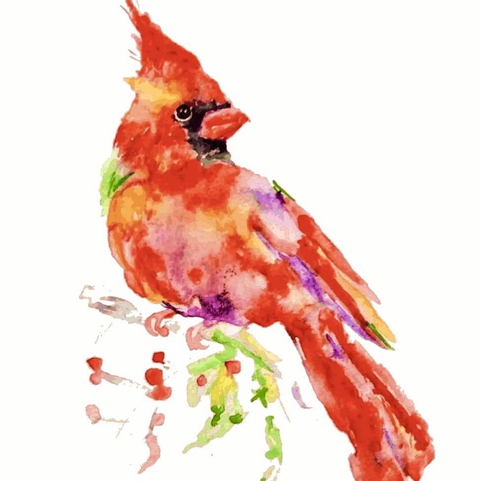
The client’s initial logo held a lot of personal meaning and was difficult for them to move on from. The reality was, while beautiful, this watercolor illustration wasn’t a viable logo. In the creation of my design proposed to the Print team, I wanted to honor the client’s traditional style and attachment to the original illustration. I simplified the watercolor and made it solid red, with the bird holding a cancer ribbon. Lavender is a color that represents all cancers in the ribbon system. I found that the cardinal red was iconic to the bird, and stood out when the logo was scaled down.
FEEDBACK AND EDITS
The client requested more color be used in the logo, as many as the original watercolor had. They wanted the multitude of colors to represent all the cancers their fund would help. I sent back these two edits, but they were still wanting more color, and to see the bird with the original watercolor pattern.
FINAL DECISION
Following the client’s wishes, I added the watercolor overlay to my design. At this point, my logo became much too similar to the original illustration, which the Pixels x Print team wanted to stray from. Creating an entire brand, complete with motion graphics and a website redesign, called for a fresh, modern logo. Fortunately, the client chose my teammate’s design, a graphically interesting cardinal in flight, and the right choice for this rebrand.


